I’ve seen a lot of websites. I’ve seen some great ones, and I’ve seen some terrible ones. Everyone has their own opinion of what a “great” website is, of course. But I can tell you that, for me, there are several things that great websites have in common.
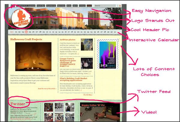
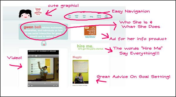
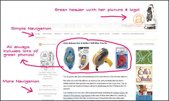
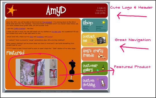
Instead of just writing out what I think, I decided to show you! I took some screen shots of some of my favorite websites and wrote in some notes about why I liked them. You’ll notice that they are all different types of sites with unique designs. But they do share a few things!
They all have clean lines, are un-cluttered, provide clear navigation, feature complementary colors, and easy to read fonts. These things combined make for a very aesthetically pleasing website. And when your website looks good, your visitors will stay longer, and your chances of making a sale increase!


Pingback: Tweets that mention Sites I Like – And Why I Like ‘Em! | IndieBizChicks.com -- Topsy.com